Thoroughline

Accessibility Design
UX Design
User Research
Participatory Design
What role does visual design play in providing reading support for ADHD?
ROLE
UX/UI Designer
TIMELINE
November 2025 - May 2026
SKILLS
Facilitation
Ui/UX Design
Prototyping
User Research
This project was in collaboration with Zentrum für Assistive Technologien Rhein-Ruhr - ZAT Rhein-Ruhr as part of their ongoing initiative to work on evidence-based assistive technologies grounded in real user needs.
A three-phase participatory approach on designing an adaptive and accessible interface for people with ADHD.
Especially anything long, anything academic. I would get to the end of a page and realise nothing had gone in. I would read the same paragraph three times. I would lose my place, lose the thread, and get through it eventually, but it took me far longer than the people around me. For a long time I assumed the problem was me.
It was only when I looked into it that I realised the struggle was built into how most reading tools work. For my master's thesis I spent over a year on it: why reading is so hard for adults with ADHD, and what support designed with them, instead of for them, would actually look like. ThoroughLine is what came out of that. A calm reading interface, shaped by a co-design study and then built into a working prototype.
For most of my life I thought I was just bad at reading.
The Premise
I went in assuming the cleverest features would win. They didn't. Across the study, what helped was quiet and predictable. What hurt was anything that demanded attention to use. The whole project pivoted on this one inversion.
The finding that surprised me: the flashy features lost.
The Pivot
WHAT I ASSUMED
More control, more features, more ways to help
Reading speedometers and live pace gauges
Persistent sidebars full of options
Aggressive peripheral blurring
WHAT THE RESEARCH RETURNED
Reducing cognitive load beat adding features, every time
Quiet typographic adjustment, the most helpful feature of all
Auto-hiding controls that recede while you read
Aggressive blurring wasejected outright, no matter how it was tuned
the left column is the version of this tool I would have built on instinct. the right column is the one the people I designed with actually wanted.
How the work moved
Three phases, each one correcting the last.
01 Co Design Workshop
Seven adults with ADHD worked through a prototype with eye-tracking and cursor feedback, telling me which features felt like help and which felt like noise. They were co-designers, not test subjects.


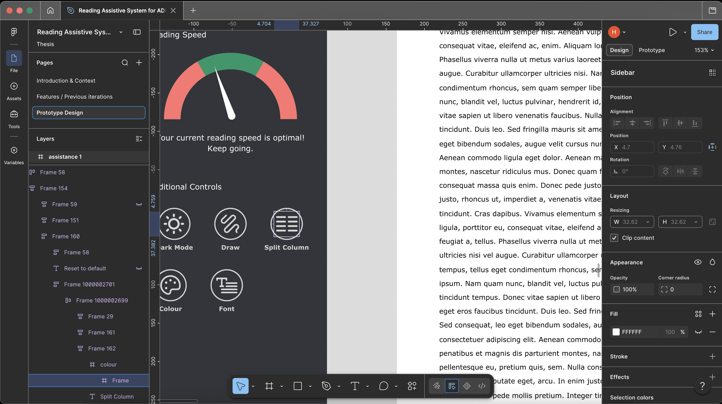
02 The redesign
I took what they told me and rebuilt the interface in Figma, then prototyped it. This is where the workshop's words became a system: what to keep default-on, what to make opt-in, what to cut.

03 Heuristic evaluation
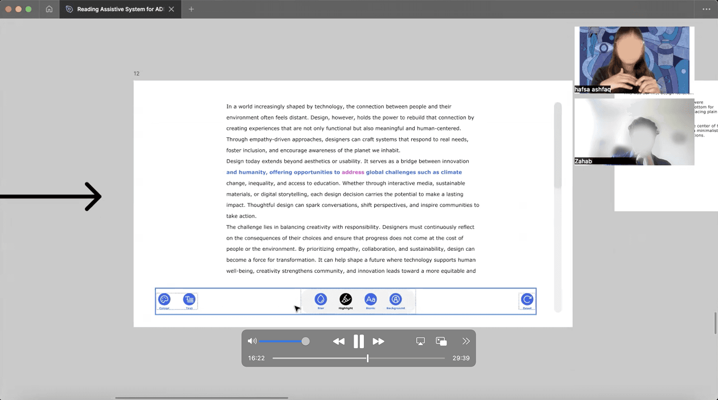
Five UX professionals with ADHD experience walked through the redesign aloud. The interesting part: they caught different things than the co-designers did. Lay users felt the cost of a highlight lagging mid-sentence; experts named the structural inconsistencies users had only absorbed as vague friction.
The research told me what was needed. It couldn't show me how it felt.
A thesis can prove a feature helps. It can't let you sit with the thing and read. So for the Figma x Contra Config Makeathon, I built ThoroughLine into a working prototype. I am a designer, not a developer. I came in with the research, the flows, and the information architecture, and Figma Make turned designs I could only ever mock up into something you can actually open and use.
Building it taught me the thing the thesis already argued, the hard way. My first version had a control panel of forty options, which is exactly what my own research says not to do. So I cut it down. Honouring my findings on cognitive load meant doing less, not more.
my early prototype told users they'd failed. building taught me to welcome them back instead.
From thesis †o the working tool
It notices how you read, and it never overwhelms.
Every feature traces back to a finding. None of it is a guess. Here are the ones that took the most working out.
What shipped
01 / typography — The most boring feature won

Size, spacing, and typeface are front and centre, on by default. They were the single strongest finding in the study, helpful to nearly everyone, and they ask nothing of you to use.
02 / presets — One tap, no fiddling

Focus to go deep, skim to move fast. Setting up a reading environment was itself exhausting for participants, so the whole thing reconfigures from a single choice.
03 / the noticing system — It watches several signals, but only ever speaks once

When your gaze or cursor drifts off the text, it brings you back to your line. When you re-read a dense passage, it offers to read it aloud. When you stall, it saves your spot. All governed, one gentle nudge at a time, never stacking, always dismissible, and you can turn it down.
04 / thought parking — Park the thought, keep your place
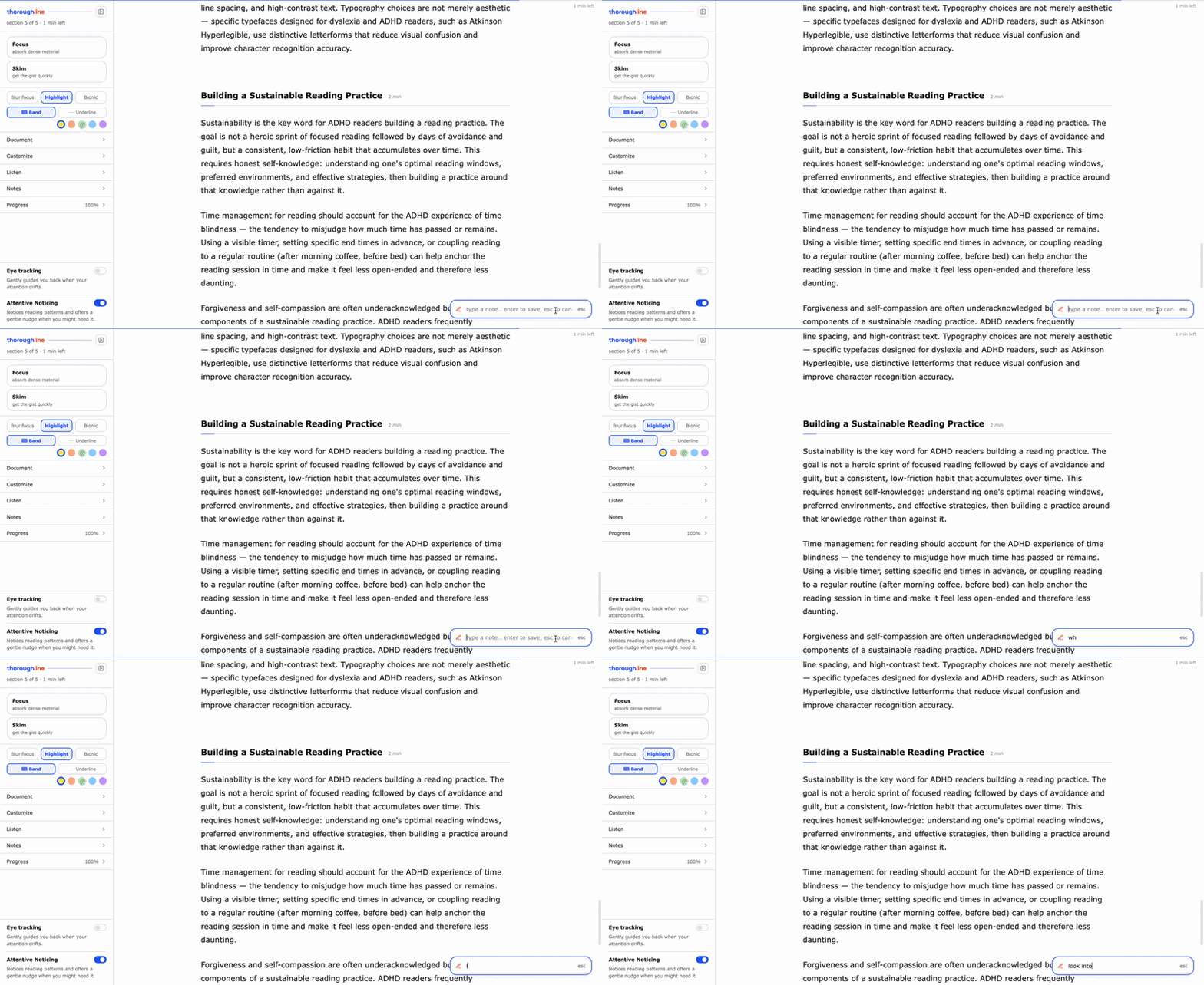
When a stray thought hits mid-sentence, you drop it into a note and keep reading, instead of losing the page chasing it. This one exists because it kept happening to me while I built it.
05 / read-aloud — Eyes and ears on the same line

When reading is hard that day, it reads to you and the text follows along, the spoken word marked so your eyes never have to find their place again.
06 / eye tracking — An honest preview

On a webcam, gaze tracking is rough. It is built to run on professional eye trackers, the kind my research team uses, where the same drift-recovery logic becomes precise. I built the interaction; the signal source is swappable.
Underneath all of it: a framework.
The study produced more than a tool. It produced a set of principles for designing reading interfaces for ADHD, in three tiers: the conditions that must exist before any feature works, how individual features should behave, and how the system should personalise. This is the synthesis the whole project points at.
The Framework

It isn't finished, and I'm not pretending it is.
The study produced more than a tool. It produced a set of principles for designing reading interfaces for ADHD, in three tiers: the conditions that must exist before any feature works, how individual features should behave, and how the system should personalise. This is the synthesis the whole project points at.
Next: Gentle comprehension check-ins, for the moment you read a page and absorb none of it. On-demand summaries you ask for, never pushed. Both need a small backend I'm adding after the deadline.
On Hardware: The eye-tracking moves from webcam preview to the professional eye trackers the research team deploys, where the drift-recovery logic I built becomes genuinely precise.
Research: A controlled study with a working build, testing whether perceived helpfulness becomes measurable comprehension. And validation across adjacent neurodivergent groups, to learn which principles are ADHD-specific and which are just good cognitive accessibility.
Where this goes
Try it yourself below
Coffee, projects, half-baked website ideas, or your hottest design take (bonus points if it's pro Comic Sans).
My inbox is open.