AafatInfo

Service Design
Product Design
Social Design
Designing for the moment of the emergency, not after.
A real-time flood reporting platform for Karachi, designed around how citizens actually describe water, find their bearings, and ask for help.
ROLE
UX Design Lead
TIMELINE
April 2024 - August 2024
SKILLS
Wireframing
Ui/UX Design
Prototyping
User Testing
QA
User Research
This project was a combined effort with Namra Khalid as the Research Lead & Project Owner, Saad Siddiqui as the Developer and me, as the Design and Experience Lead.
Karachi sits at the front of this. Twenty million people, drainage that hasn't been redesigned in decades, a coastline that's rising. Every summer the same streets go under and the same neighbourhoods are cut off. People die. Cars stall. Children get stuck on the wrong side of the city.
When the roads flood, the way you find out is your phone. A cousin three streets over sends a voice note. The area WhatsApp group asks if it's safe to come home from work. The TV news catches up forty minutes later, by which point the people who needed it had already made a decision. Most of the time, you don't even have access to watching the TV news since the power is cut off.
There was no shared map of what was happening in the city, in real time, from the people on the ground. Information moved person to person, which is fast inside a network but invisible outside it. If your three streets weren't flooded, you'd have no way of knowing the next three were.
Pakistan is fifth on the Climate Risk Index. The roads flood every monsoon.
The Situation

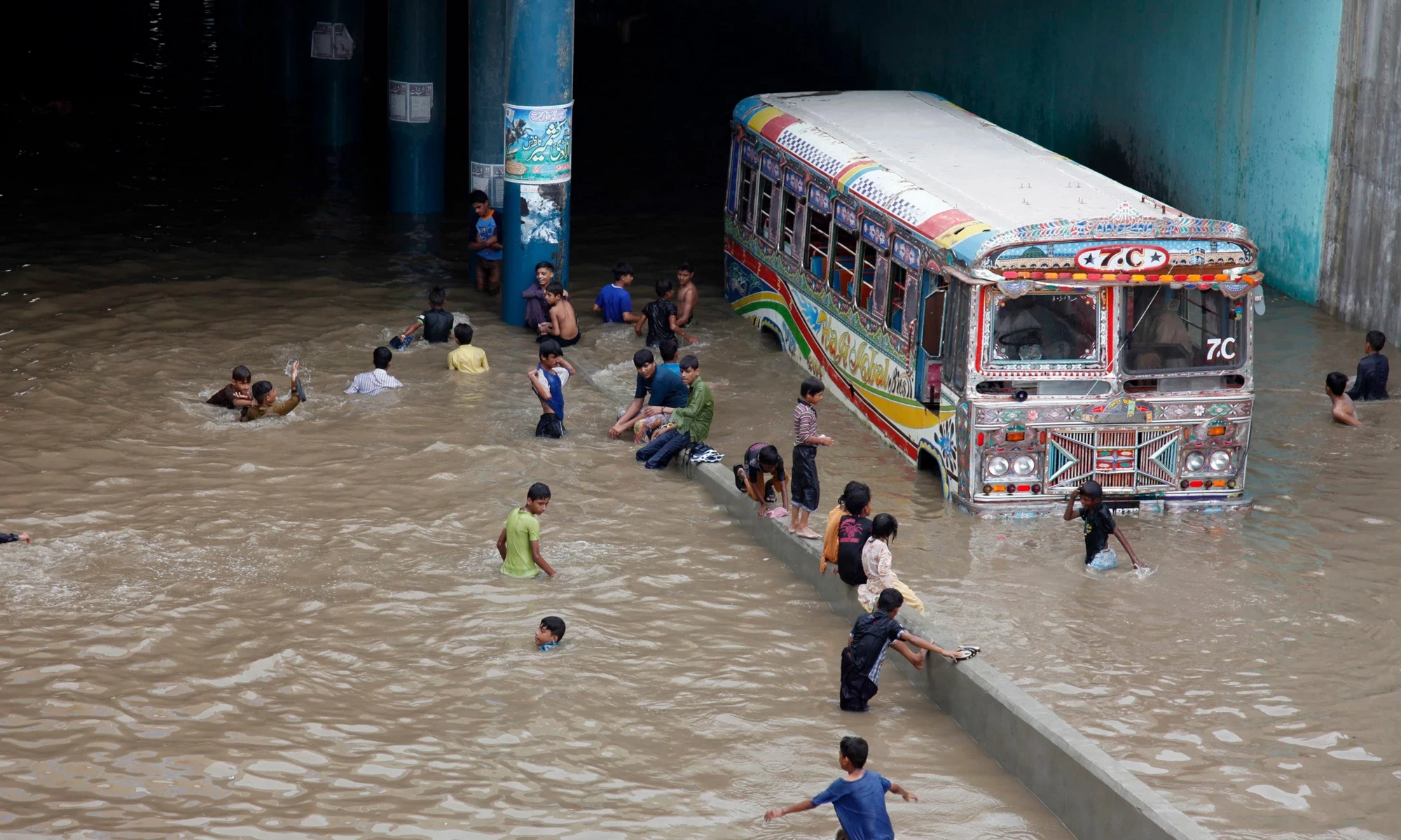


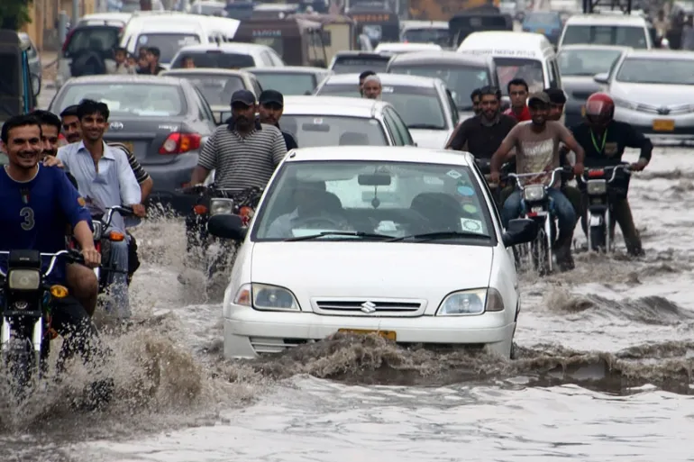


AafatInfo is the Pakistan adaptation of CogniCity OSS, the open-source disaster reporting platform that runs PetaBencana in Indonesia and MapaKalamidad in the Philippines. The tech architecture, the API keys, and the funding came from Yayasan PetaBencana and re:arc SouthxSouth East Asia. That was the partnership.
What couldn't be ported was the design. Karachi is not Jakarta.
The infrastructure assumptions, the language, the way people give directions, the icons that mean something at a glance, the trust dynamics around official channels. None of these translate. The job for the Pakistan team was to take a working global model and rebuild the version of it that someone in Lyari or North Nazimabad would actually use in the worst week of monsoon on a phone with one bar of signal.
The tech came from Indonesia but the design had to come from Karachi.
The Partnership
PORTED FROM PETABENCANA
Technical Architecture
Data Pipeline
API Infrastructure
Funding
BUILT FOR KARACHI
Language and Terminology
Visual System and Icons
Reporting Flow
Depth and Location Logic
Research
6 workshops. 600+ citizens. Four groups.
The team ran workshops, interviews, and co-creation sessions. Sessions were a mix of in-person and online. We asked how people currently report flooding, who they tell first, how they describe what they're seeing, what they trust, and what gets in the way of asking for help. The conversations were in Urdu, English, and a mix of both.
The research happened in layers. Pre-launch co-creation workshops at Habib University. Working class interviews and cartographic literacy tests. Expert interviews with frontline disaster responders, climate activists, and community workers. Then user testing inside Machhar Colony, one of the most flood-prone informal settlements in the city. Each layer surfaced something the previous one had missed.


Session credits: Namra Khalid, Saad Siddiqui and Hira Zuberi
Findings
Three findings reshaped the whole interface.
FINDING 01
People in Karachi don't read maps the way mapping apps assume.
Drivers can navigate a map app fine. Working class users, particularly women, often cannot orient themselves on a satellite view or a road grid. Directions in Karachi are landmark-based. "Turn left at Quaid bazaar, go straight until the water tank, then left at the big tree." In Machhar Colony testing, auto-location and search functions failed entirely. Many users noted the absence of recognisable local labels and poor map detail.
FINDING 02
Nobody describes water depth in centimetres.
Across workshops, participants described floodwater by what part of the body it reached. Takno tak paani (ankle-deep). Ghutno tak paani (knee-deep). Maathe tak paani (forehead-deep). The other reference was cars. Water at the tyre. Halfway up the door. Over the bonnet. When asked to draw flood depth, 36 participants reached for human and car silhouettes far more than any abstract measurement. A slider asking for "depth in cm" wasn't going to get filled out by anyone.
FINDING 03
Reporting happens in the moment of the emergency, not after.
The people most likely to report are doing it while they're inside the situation. One hand on the phone, one hand on a child or a bag or a doorframe. Rain on the screen. Network dropping. Trying to help someone else at the same time. The reporting flow had to assume duress, not calm input.
A discussion note that changed how we thought about depth
"At times there is so much water and no reference point for a layman to know the depth. Body is also not a useful method to measure then as there is no one actually in the water. Water has high electrocution risk."
workshop 1 discussion notes, Habib University, January 2024
The moment that complicated it
This complicated the body-as-scale insight. The Urdu language of flood depth is rich and shared. It is also a language of exaggeration, and in the worst floods nobody is standing in the water to measure it against themselves. The depth selector had to do two things at once. Honour the cultural metaphor so users felt addressed. And give them a way to estimate when the metaphor stopped working.
We asked, "how would you draw the depth of a flood?"

The first version of the depth selector used a motorcycle and a rickshaw as references, because those vehicles are everywhere in Pakistan. 53% of the population owns a motorcycle, only 9% owns a car. The data above is why that didn't survive. People don't think in motorcycles when they think in floods. They think in their own body. They think in the cars that stay in the frame.
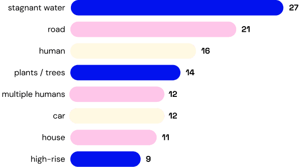
objects we initially tested as references - source · workshop 1 drawing activity, Habib University, January 5 2024
Workshop Insights
A human silhouette and a car, calibrated to Pakistan.
The user picks the level the water is at against a body silhouette in shalwar kameez. Ankle, knee, waist, chest, above the head. Heights are set against average Pakistani adult heights, 5'7" for men and 5'2.5" for women. Next to the figure is a car, with depth marked at the tyre, the door, the bonnet, and above the bonnet. The car silhouettes are pulled from the most commonly sold cars in Pakistan, including the Suzuki Alto, Toyota Corolla, and Honda City.
Depth Selector

The gender toggle. Useful intent, complicated reception.
The toggle exists because the depth reading is calibrated to height, and male and female average heights in Pakistan differ by five inches. A waist-deep reading on the female figure is not a waist-deep reading on the male figure. The toggle makes the measurement accurate, not symbolic.
User testing in Machhar Colony surfaced a different reading. Participants raised concerns that the toggle felt like the platform was tracking gender unnecessarily. Some recommended removing it entirely. The intent and the reception had drifted apart.
A decision still being weighed
Three steps. Most fields optional. Photo and voice before typing.
An early version of the form asked for typed input across multiple fields. Testing made it obvious nobody in a real flood was going to type. The redesigned flow puts photo upload and voice notes at the top of the report and makes most text fields optional. A user can submit a valid report with three actions. Select location. Mark depth on the silhouette. Attach a photo, voice note, or tap a few items on the checklist. The terms in the interface use the language people actually use, so a sewage canal is a nala, not a sewage canal.
The checklist deserves a sentence. It's a set of illustrated icons covering the situations most worth flagging during a flood: live wires, collapsed structures, broken roads, open drains, flooded underpasses, malfunctioning traffic signals. User testing added cracked roads, dead animals, slippery slopes near bridges, sewage overflow, and major accidents. A user can tap a few of these and submit, no typing needed.
Report flow

How flood information moved before AafatInfo.
Person to person, through closed networks. Fast inside, invisible outside. 58% of workshop participants rely on WhatsApp during floods, 16% on Facebook, 11% on Instagram, 10% on mobile networks, 5% on X. The map below is what we drew up in research to describe the problem to ourselves.
The gap

Six pieces of the platform are live and being tested.
What we shipped
01
Live flood map
Reports from across Karachi, depth shown by marker colour, clustered by area so the map stays readable when reports come in fast.
02
Report submission flow
Three primary steps, most fields optional, designed to be completable in under thirty seconds with one hand on a bad signal.
03
Depth selector
Body silhouette and car, calibrated to Pakistani averages, defaulting to the female figure.
04
Illustrated checklist
Live wires, open drains, collapsed structures, flooded underpasses. A way to report without typing.
05
Onboarding and home screen
A first-use sequence explaining what the app is, who it's for, and what your report does for other people.
06
Brand identity
Type, colour, and iconography built specifically for this audience, not a generic disaster-tech look.
In Karachi, location data is not a neutral object.
Research surfaced two concerns the team took seriously. The first is privacy in informal settlements. If a resident submits a flood report from inside an unregistered colony, and that report is layered on top of municipal drainage data, the result is geocoded evidence of who lives where. That can be used in eviction cases. The safer model for this is still being designed.
The second is trust. Research surfaced widespread distrust of official authorities, stemming from past mismanagement and perceived manipulation of disaster data. There is also distrust of large international NGOs, related to previous scandals and concerns about cultural insensitivity. AafatInfo cannot lean on a government endorsement or an INGO logo to build credibility. Trust has to be built citizen-to-citizen, through the platform doing what it says it will do.
Depth Selector
Design Prototype
Coffee, projects, half-baked website ideas, or your hottest design take (bonus points if it's pro Comic Sans).
My inbox is open.